
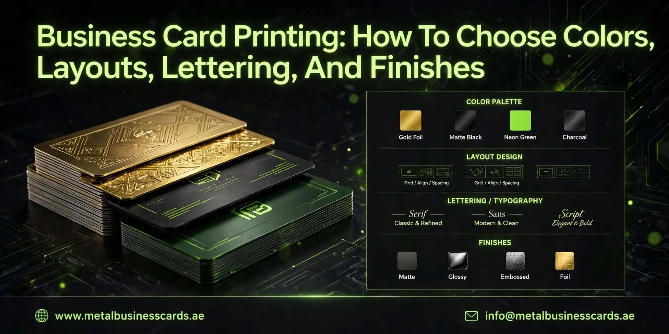
Business Card Printing: How To Choose Colors, Layouts, Lettering, And Finishes
A business card may be small, but the impression it creates can have a lasting impact on how people perceive your business. A thoughtfully designed card communicates professionalism before you even say a word, whether you are meeting potential clients, attending networking events or introducing a new brand.
The challenge is to know which colors, fonts, layouts and finishes will represent your business effectively. It may feel overwhelming to make the right choices with so many printing options available. This guide explores the essential design decisions that can help you to create an attractive, practical and memorable business card.
How To Choose The Right Colours for Your Business Card
Colour influences how people recognise and perceive a brand. The right combination of colours can make your card visually appealing and ensure its information remains easy to read.
1. Understand Your Brand Personality
You should start by considering what your business represents. Blue often communicates reliability and professionalism, which can make it suitable for financial services and corporate brands. Green is suitable for environmentally focused companies and black and gold can create a premium appearance. You should choose shades that already appear in your logo and marketing materials to maintain brand consistency.
2. Use A Balanced Colour Combination
You must avoid filling every available space with different shades. It is best to choose one dominant colour, a supporting shade and an accent colour for important details. Strong contrast between the background and lettering can also improve readability. October 2025 consumer research that involves more than 1,000 respondents highlights how design choices can influence the impressions people form of business cards.
Which Business Card Layout Works Best?
A good layout for business card printing can make information easy to find without making the card feel crowded. Every element should have a purpose, from the placement of your logo to the spacing around your contact details.
● Choose Between Single-Sided And Double-Sided Designs
Single-sided cards are suitable for minimalist branding, particularly when you only need a logo, name and essential contact information. Double-sided designs provide additional space for a tagline, services, social media details or a QR code. You should use the reverse side strategically instead of repeating information unnecessarily.
● Follow A Clear Visual Hierarchy
Your name, business identity and contact information should be distinguishable at first glance. It is best to make the most important details slightly larger or bolder. You should leave sufficient empty space around individual elements. White space is not wasted space and it gives the design room to breathe.
How To Select The Best Lettering And Fonts
Typography can affect both appearance and readability. A beautiful font is not necessarily a practical choice when someone needs to read your phone number quickly.
1. Pick Fonts That Match Your Industry
Serif fonts can communicate tradition and authority and sans-serif styles generally create a clean and contemporary appearance. Creative businesses may experiment with distinctive lettering, but professional services should prioritise clarity. It is ideal to use no more than two complementary font families.
2. Pay Attention To Font Size And Spacing
Small lettering can become difficult to read after printing, especially when the design includes several contact details. You should keep names and business titles prominent and avoid squeezing information into narrow spaces. Must check letter spacing, line height and alignment before approving the final artwork.
Which Finishes Make A Business Card Look Premium?
Finishes of a card influence how a card feels in someone’s hand and how its design interacts with light. The right treatment can add character without making the final product unnecessarily expensive.
● Matte And Gloss Finishes
Matte lamination can create a smooth and understated appearance with reduced glare, which makes it suitable for professional brands. Gloss finishes can produce a brighter surface that can make photographs and vibrant colours stand out. You should consider how the finish complements your overall design.
● Spot UV And Embossing
Spot UV applies a glossy coating to selected areas, such as logos or brand names, that can create contrast against a matte background. Embossing can raise specific design elements and debossing can press them into the paper. Both options can add texture and can make a simple design feel more distinctive.
● Choose The Right Paper Thickness
Paper quality is important just as much as appearance. Thicker cardstock often feels more substantial and durable than lightweight alternatives. Options such as textured, recycled and cotton paper can also communicate different brand values. You can also ask your printer for physical samples before placing a large order.
What Are The Steps To Design And Print A Professional Business Card?
It is best to plan the project before you send artwork to a printer to help prevent expensive mistakes. These practical steps will cover the process from initial concept to final inspection.
1. Identify Your Essential Information
You need to decide which details recipients genuinely need. These include your name, business name, designation, email address, telephone number and website. Must add a physical address only when it is relevant to your customers.
2. Create A Consistent Design
You should bring your chosen colours, typography and logo together in one visual direction. Printing of business cards should focus on balancing brand identity with practical readability instead of simply adding decorative elements during this stage.
3. Prepare The Artwork
Most professional printers often request CMYK colour mode, a print-ready PDF and images at 300 DPI. Standard dimensions vary according to the market, with 85 × 55 mm being a common option. You should allow approximately 3 mm of bleed and keep essential information inside the safe area, which follows the specifications of your printer.
4. Explore Modern Interactive Features
You should consider to add a QR code that directs customers to your website, portfolio or booking page. Another option is NFC business cards, which use near-field communication technology to share digital contact information with compatible smartphones. It is best to test every digital link before approving production.
5. Review A Physical Proof
You should never rely entirely on how artwork looks on a computer screen. Printed colours, paper texture and small lettering can appear different in reality. You can also examine a sample for cutting accuracy, colour consistency, alignment and overall finish before ordering in bulk.
Frequently Asked Questions!
What information should never be missing from a business card?
Your name, professional title, business name and at least one reliable contact method are crucial. You can also include your website, social media profile or business address, depending on your industry. It is better to prioritise useful information instead of trying to fill every available space.
How many business cards should I order initially?
If you are launching a new business or testing a design, you should start with a smaller batch of approximately 100–250 cards. This will give you an opportunity to evaluate the print quality and gather feedback. Larger quantities may offer better per-card pricing once you are confident in the design.
Are rounded-corner business cards worth considering?
Rounded corners can provide a softer appearance and can help you to prevent sharp edges from becoming worn. They work particularly well for modern, creative and lifestyle brands. They are not essential, but this small finishing detail can make an otherwise conventional design feel different.
Can I print business cards at home?
Yes, if you have a suitable printer, compatible cardstock and accurate cutting equipment, then you can print business cards at home. Home printing works for small quantities and temporary requirements. Professional printing is generally preferable when you need consistent colours, specialised finishes, precise trimming or a more polished presentation.
How can I prevent my business card design from looking outdated?
You should keep the design focused on your brand instead of following short-lived visual trends. Must choose readable typography, balanced spacing and a restrained colour palette. Ensure you review your contact details and branding periodically so you can update the artwork whenever your business identity or professional information changes.
Final Thoughts
A successful business card is the combination of attractive design and practical functionality. You should choose colours that can reflect your brand, create a balanced layout and select lettering that remains readable at a glance. It is better to give equal attention to paper quality and finishing because these details can influence the overall experience. It is most important to check your artwork carefully before approving production. A well-designed card can support meaningful business relationships long after your first meeting.

As a content specialist for MetalBusinessCards.ae, I focus on sharing insights into premium metal business cards, luxury branding, and modern identity solutions. My work highlights design trends, materials, and creative strategies that help businesses build strong, memorable brand impressions.